How Might We Help Diners Make Confident Choices Without App-Hopping?
Role
UX/UI Designer
Timeline
4 weeks, December 2024
Platform
Mobile App
The Problem
Diners often juggle multiple apps to find restaurants, check menus, and make reservations. This fragmented experience causes information overload and decision fatigue, making it harder to choose where to dine.
The Mission
To simplify how people discover, decide, and share dining experiences — all in one cohesive platform.

Identifying The Problem
Discovering restaurants feels more fragmented than it should.
Through surveys and interviews with 36 participants, I found that many users struggled with fragmented restaurant discovery experiences. They often switched between multiple apps to check reviews, menus, and availability — a process that felt time-consuming and repetitive.
Q.Which platforms or apps do you use to explore restaurants?
14 (38.9%)
Google Maps
10 (27.8%)
OpenTable
5 (13.9%)
Yelp
4 (11.1%)
Beli
1 (2.8%)
TikTok
1 (2.8%)
Other
1 (2.8%)
I like seeing what people eat through photos, but the interface feels too complicated.
What’s Missing in Other Apps?
No App Delivers Visuals and Details Simultaneously.
To identify where existing apps fell short, I analyzed Instagram, Google Maps, Yelp, and OpenTable by evaluating their social-media style browsing, detailed reviews, local recommendations, and location data. I discovered that no platform offers immersive visual discovery alongside comprehensive menu and reservation details at the same time.
Based on these insights, I defined three key goals for the app.
VISUAL DISCOVERY
Enable users to explore restaurants through immersive, image-driven browsing that reflects real dining experiences.
DETAIL DEPTH
Provide comprehensive restaurant profiles with menus, hours, reviews, and location data in one cohesive view.
USABILITY
Design a user-friendly, intuitive interface that minimizes cognitive load and streamlines the decision-making process.
Design Foundation
Translating research insights into structured, actionable design decisions.
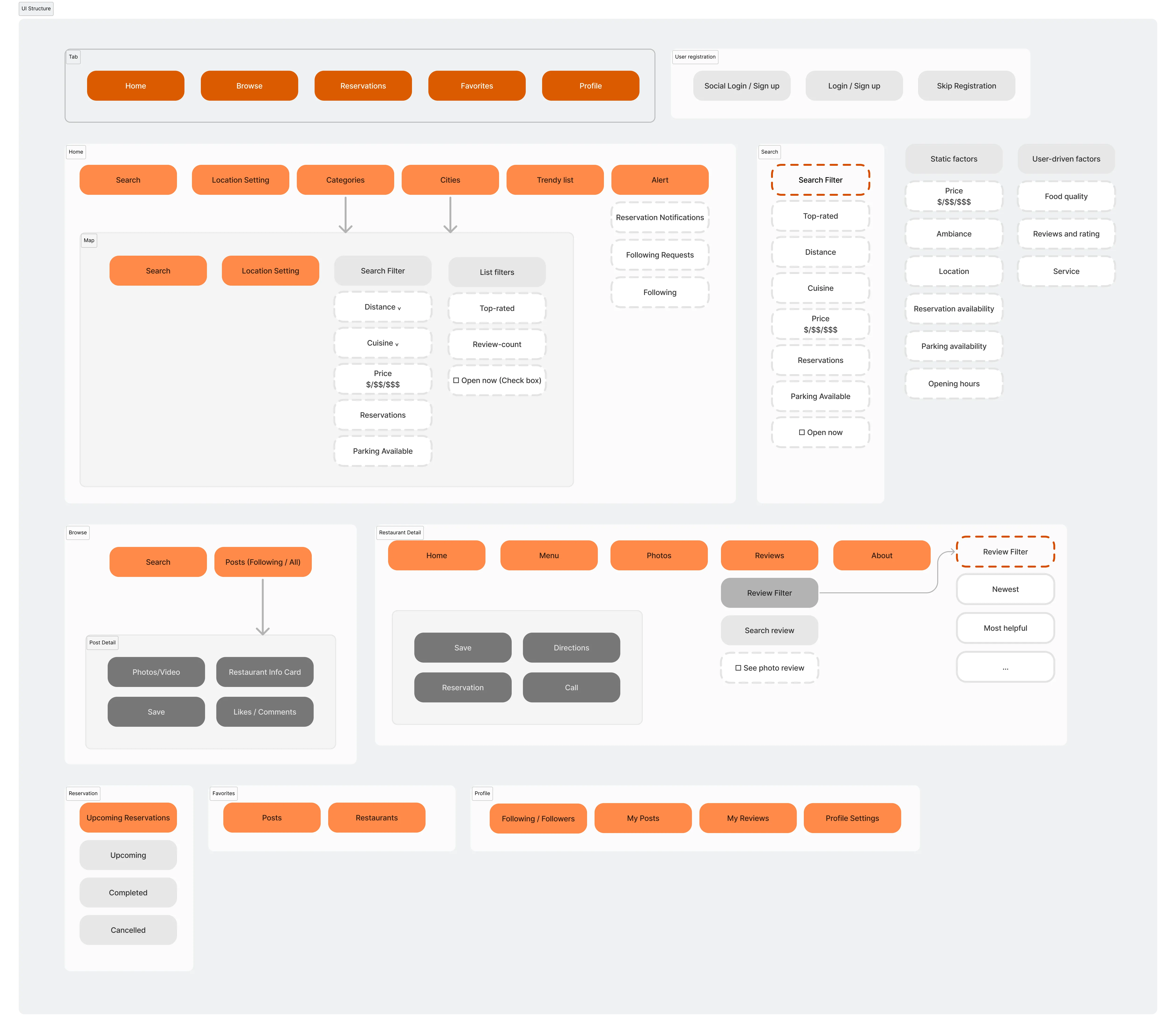
INFORMATION ARCHITECTURE
Making Navigation Simple and Predictable
To establish a clear and scalable structure for the app, I designed an information architecture that defines how users navigate and interact across key sections such as Home, Browse, Map, and Reservations. This framework helped clarify feature hierarchy and user flow, ensuring a seamless experience across exploration, and decision-making.
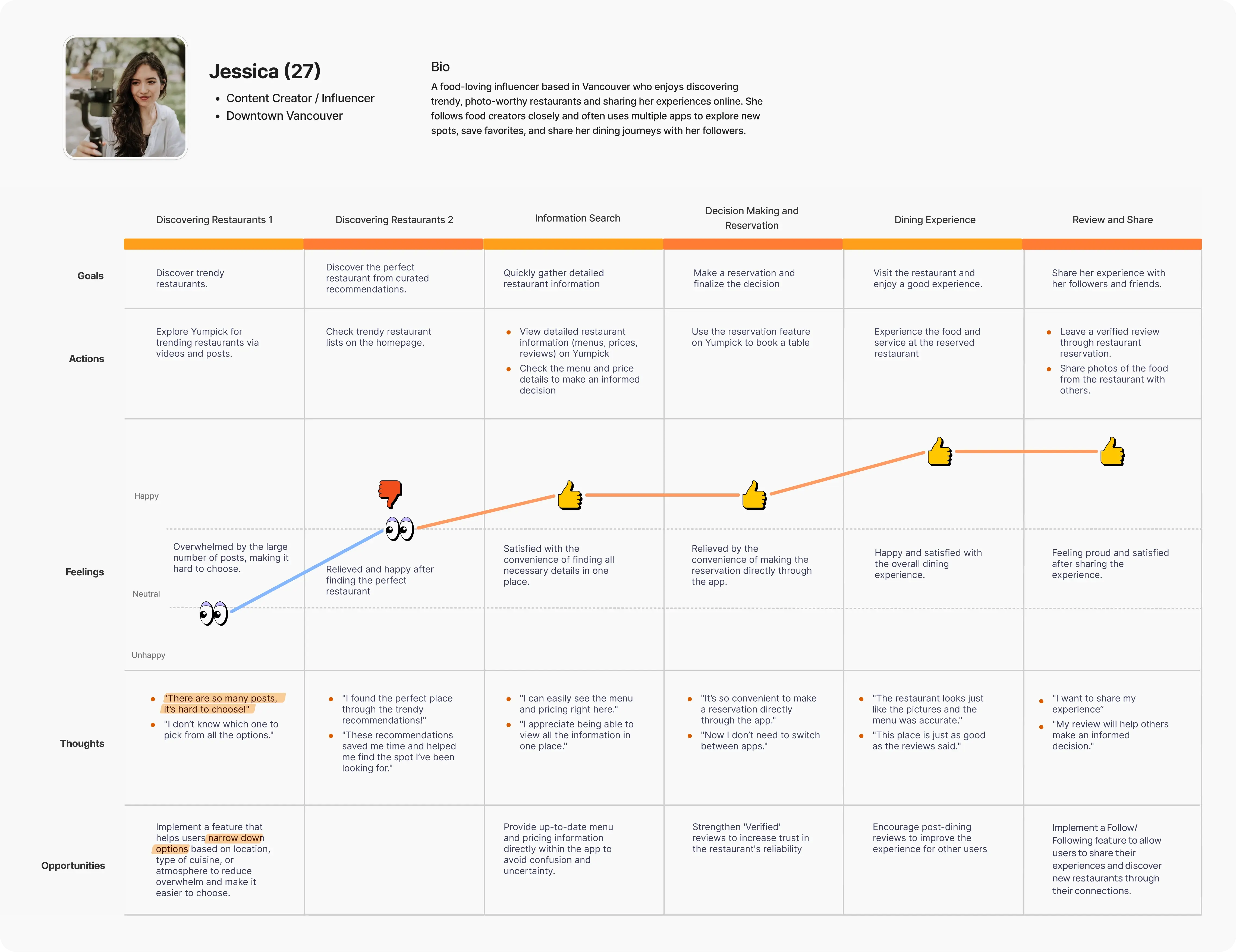
USER JOURNEY MAP
Identifying Friction Points That Shaped the Experience
To translate research insights into a clear design direction, I created a user journey map that visualizes how users discover, decide, and share dining experiences. By mapping their goals, emotions, and pain points, I identified key friction areas and opportunities that shaped the app’s core flow and interaction design.
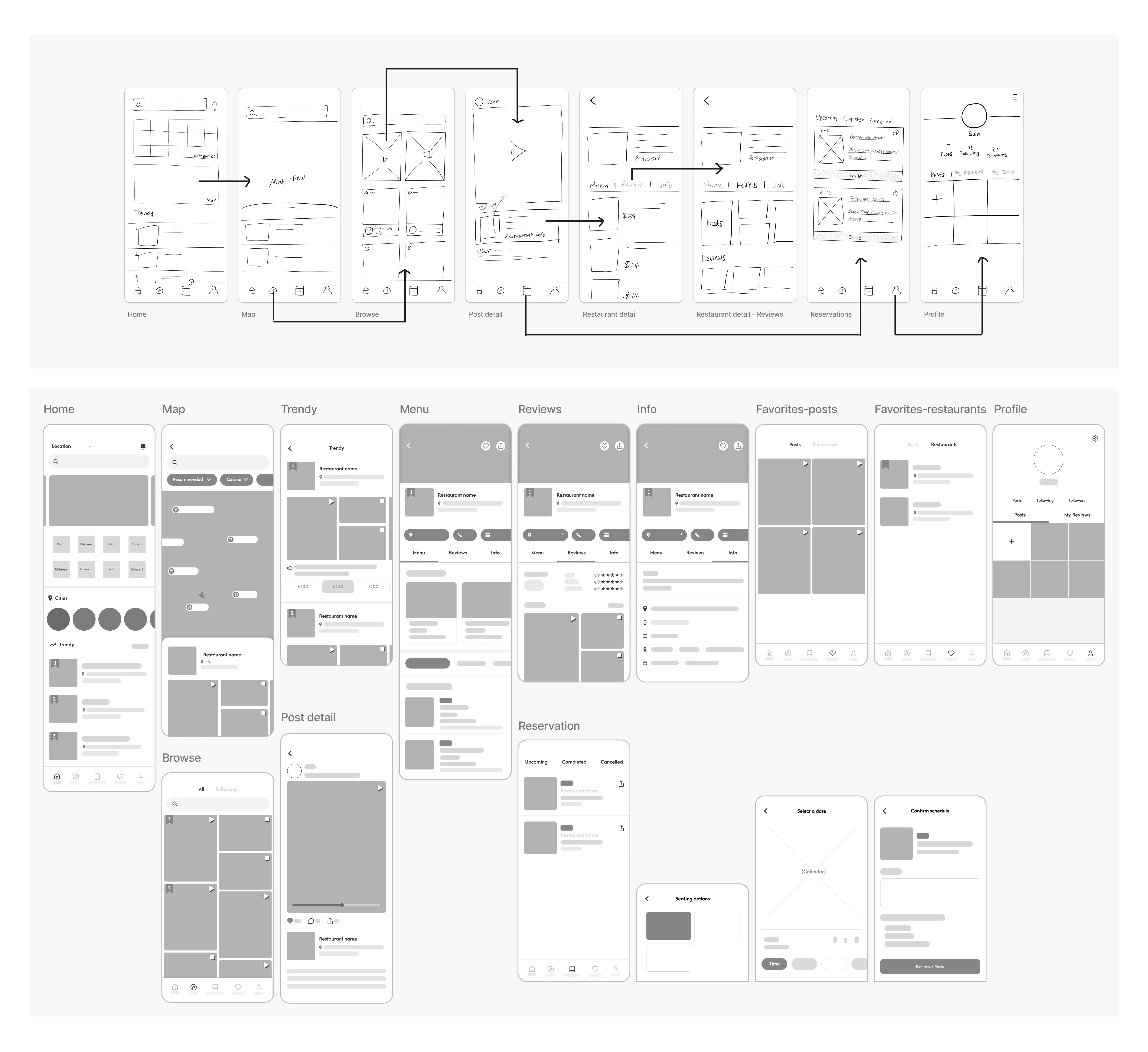
Early Design Exploration
Transforming Insights into Tangible Design Concepts
I started shaping early design concepts based on the insights from the user journey map and information architecture. Through low-fidelity sketches and wireframes, I explored how key features connect across screens, refined the navigation flow, and established a foundation for the high-fidelity design phase.
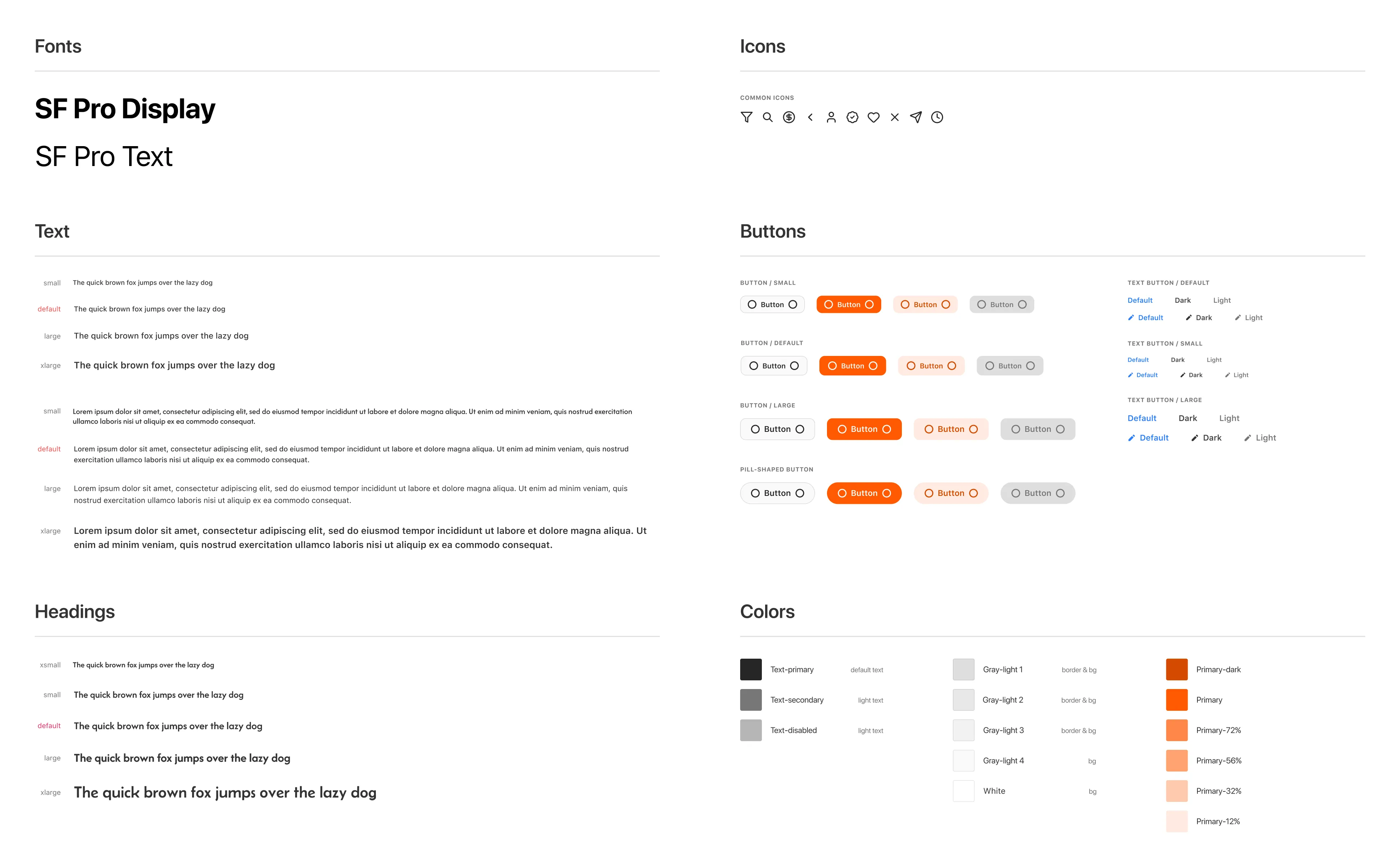
DESIGN SYSTEM
Ensuring Visual Consistency and Design Efficiency
Before moving into high-fidelity design, I established a design system to ensure visual consistency, accessibility, and interaction coherence across the product. This system created a unified framework that strengthened usability and supported efficient iteration throughout the design process.
The Solutions
Combining visual exploration, detailed information, and seamless usability in one platform.
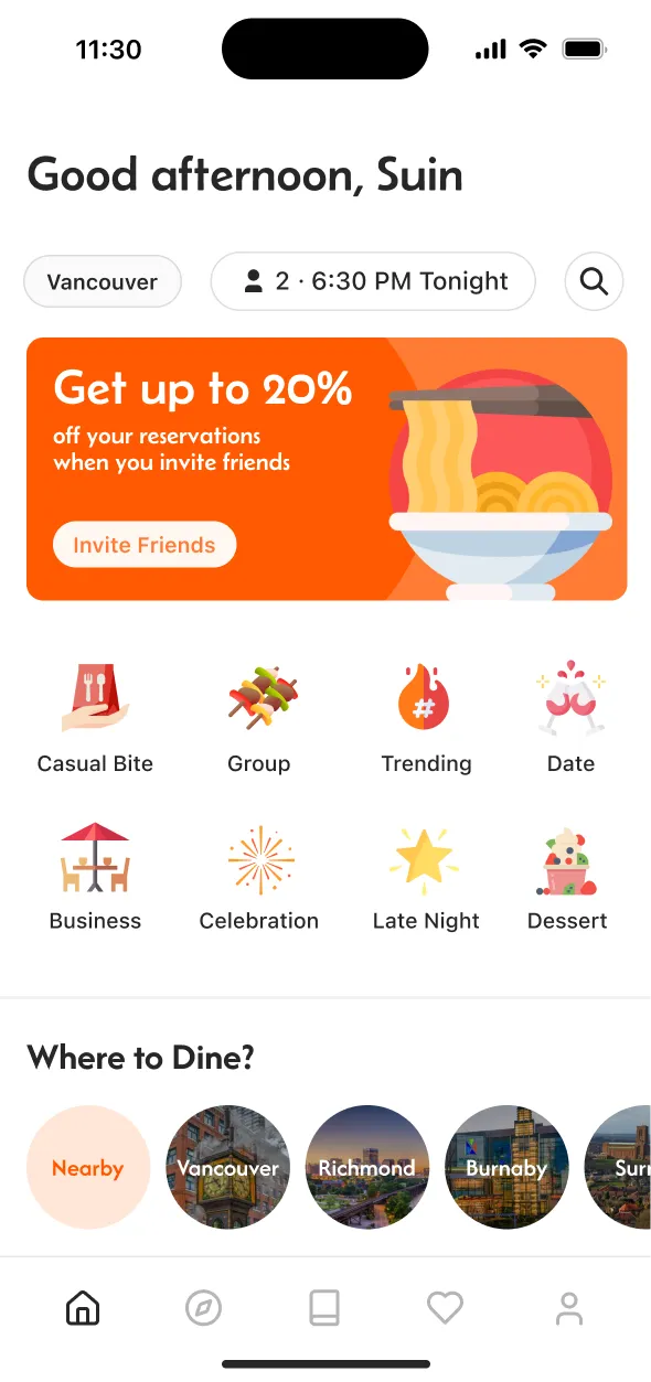
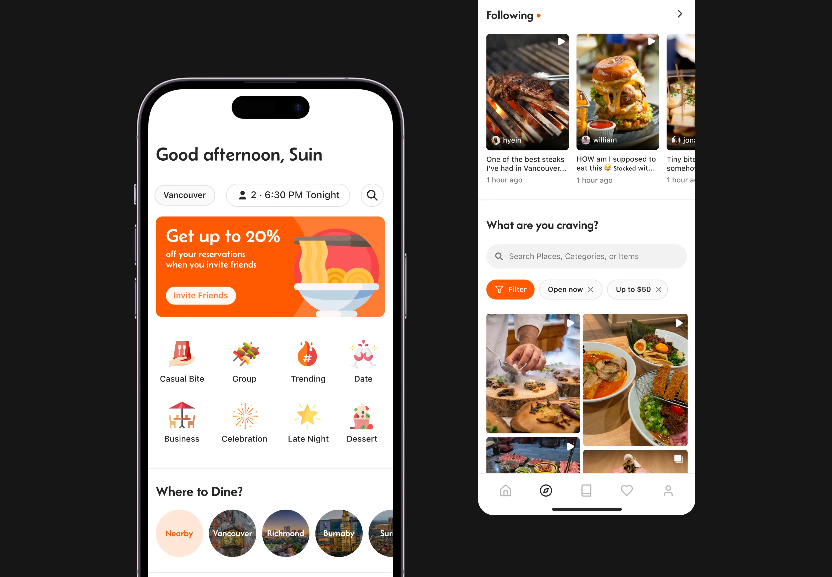
SOCIAL DISCOVERY FEED
Created the main flow and interfaces for users to visually browse, discover, and access restaurant information in one place.
Discover restaurants through engaging food photos and videos. Save places that catch your attention or explore trending dishes nearby. Instantly access restaurant menus, reviews, and pricing details without leaving the feed, turning visual inspiration into confident dining choices.
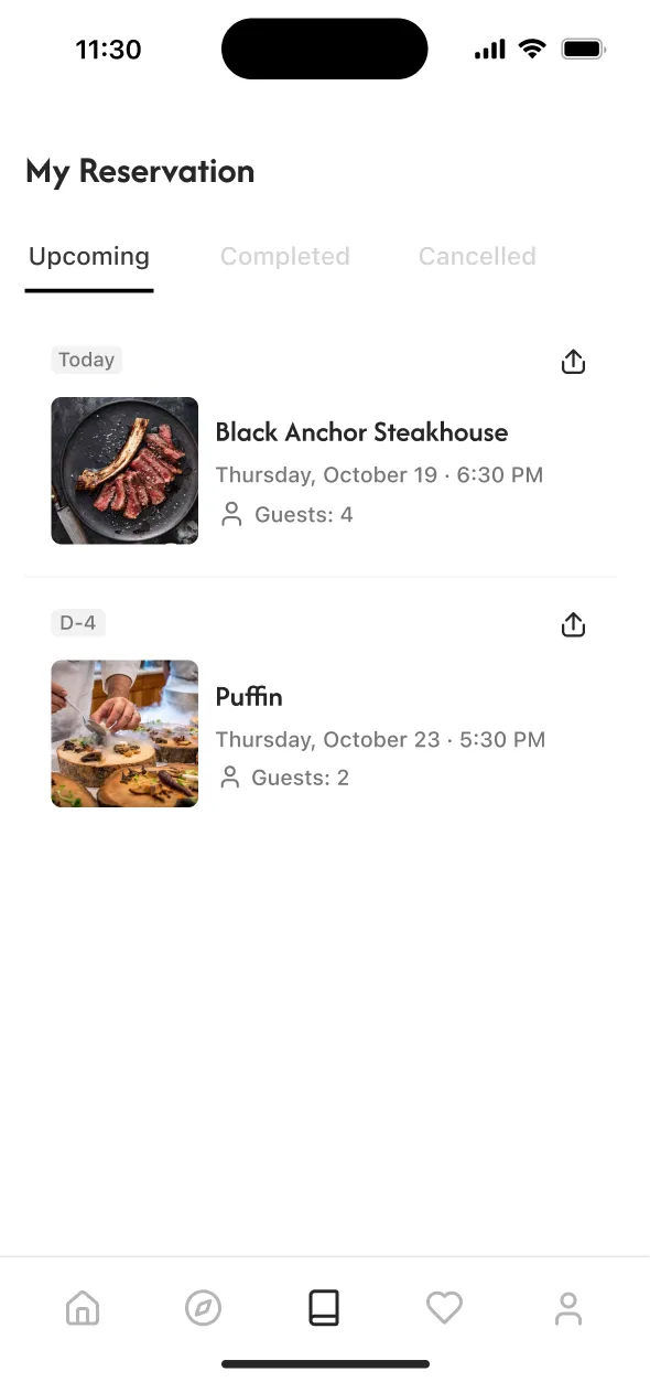
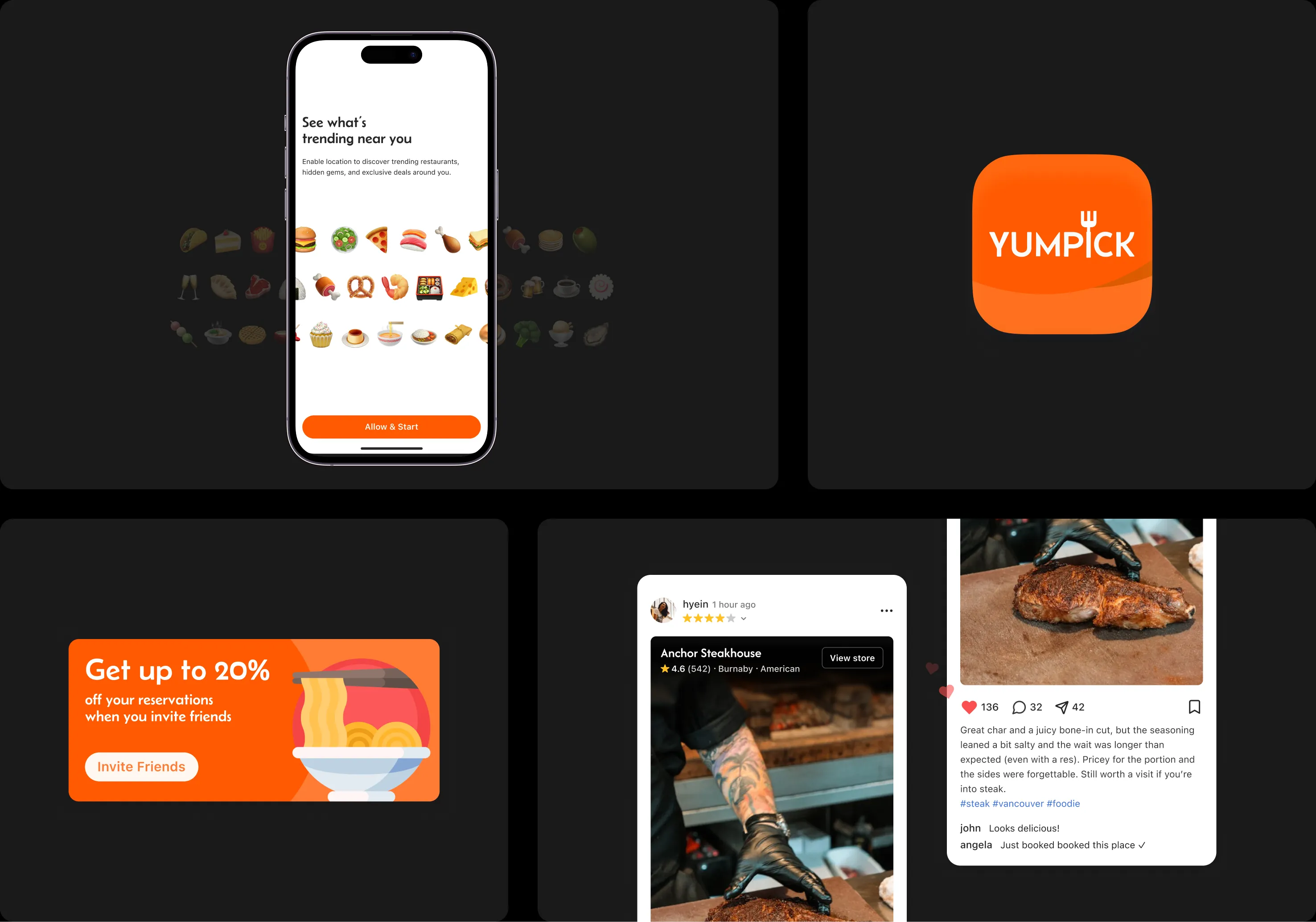
RESERVATION
Designed a connected reservation experience that bridges discovery and decision-making.
Users can move effortlessly from exploring restaurants to securing a table within the same flow. By integrating exploration and booking, the experience feels continuous and intentional, turning casual discovery into confident dining plans.
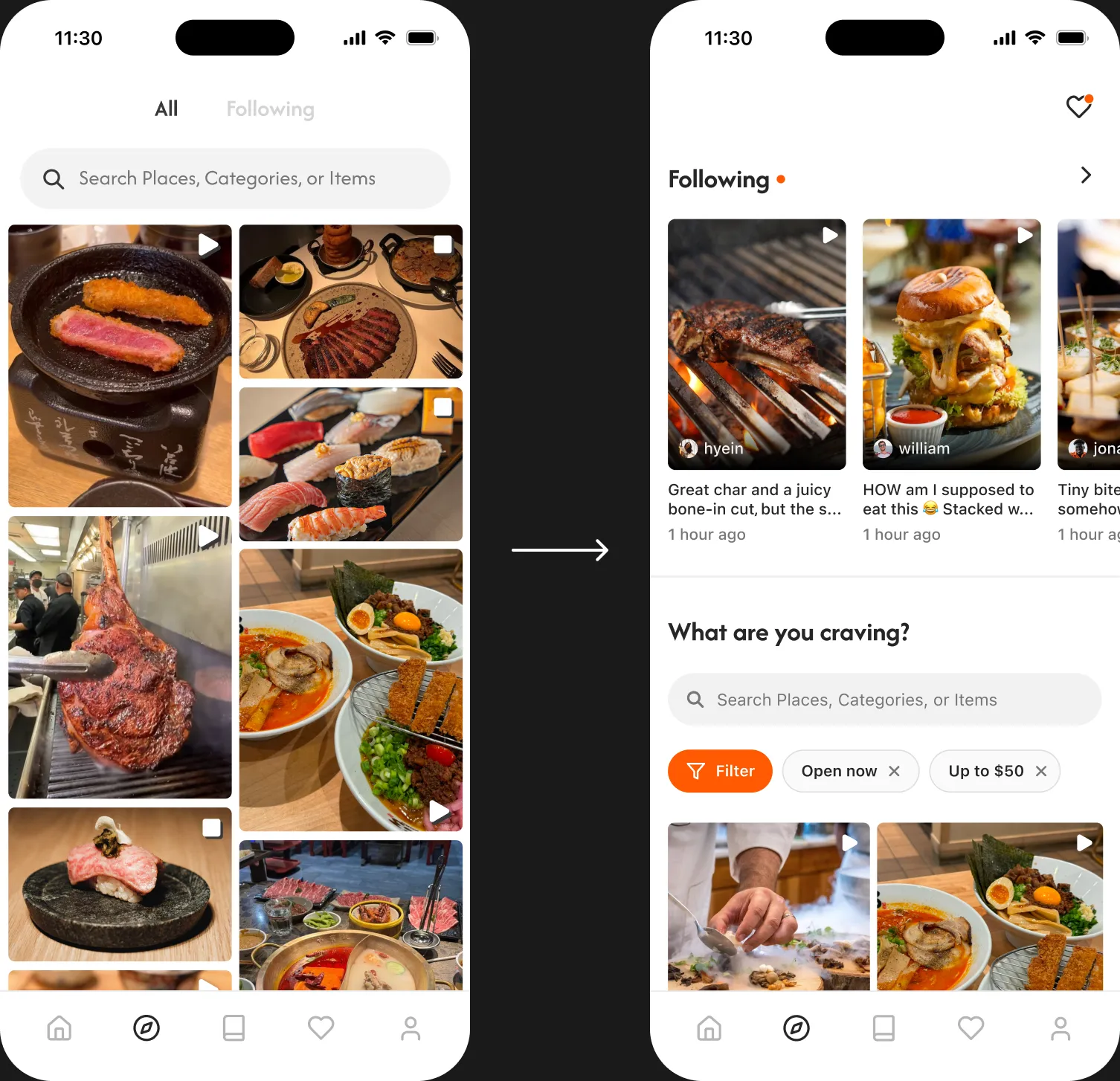
INTEGRATING FEEDBACK
Enhancing user engagement and personalized discovery through a unified, visually-driven browsing experience.
Through user testing and feedback, I refined the browsing flow to make restaurant exploration more seamless. I combined the “Following” and “Browse” sections into one integrated experience, allowing users to explore both personalized and general posts within a unified feed for smoother discovery and interaction.
Reflection
Trying to solve it all only blurs what really matters.
In the research phase, I felt overwhelmed by the range of issues uncovered through surveys, interviews, and competitive analysis, so many that I wondered how to tackle them all in one app. To regain focus, I identified the highest-impact problems and set clear scope boundaries, tackling core features first. This iterative approach allowed me to refine Yumpick into a lean prototype that truly addresses user pain points.
Ultimately, I learned that defining a manageable scope and centering every decision on real user needs are essential to creating meaningful, user-focused solutions.